New SatelliteGuys APP NOW AVAILABLE!

Status
Not open for further replies.
Trying the new app. It's cleaner, and it can load uplink threads that choke the old app, but I'm not sure I'll get used to the add floating near the bottom of the screen.

Any chance it can be coded to be at the bottom of the screen instead of above like it is?


Posted Using The New SatelliteGuys Reader App!

It's not floating on my iPhone 5. It is all the way to the bottom.


Posted Using The New SatelliteGuys Reader App!
 
It's not floating on my iPhone 5. It is all the way to the bottom.


Posted Using The New SatelliteGuys Reader App!

It is on mine when I am in the actual threads, not when browsing forums with the menu at the bottom.


Posted Using The New SatelliteGuys Reader App!
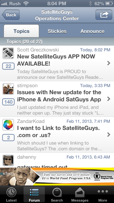
 
Trying out the new APP. I much prefer the older one

The new one is slower, more cluttered, and has advertisements.

The UI, the speed, and the cleanness of the original APP is much better.


Posted on my Jailbroken iPhone 5 Using The New SatelliteGuys Reader App!
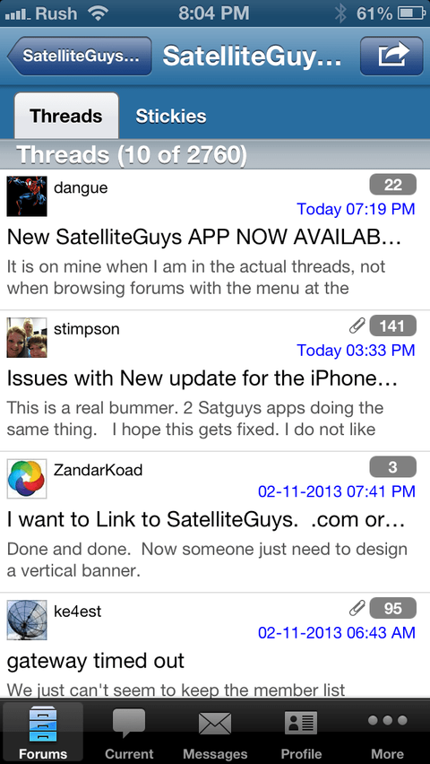
 
Look how much less cluttered and cleaner the original APP is.

New APP
image-3461868695.png

Old APP
image-2617285007.png

Sent from my Jailbroken iPhone 5 using SatelliteGuys
 
Look how much less cluttered and cleaner the original APP is.

New APP
View attachment 85361

Old APP
View attachment 85362

Sent from my Jailbroken iPhone 5 using SatelliteGuys

The only thing that makes it look cluttered to me is the ad. Everything else can be useful. I really like the "latest" tab and the "participated in" feature. It allows me to quickly get in and see all my new responses from multiple areas of the site.


Posted Using The New SatelliteGuys Reader App!
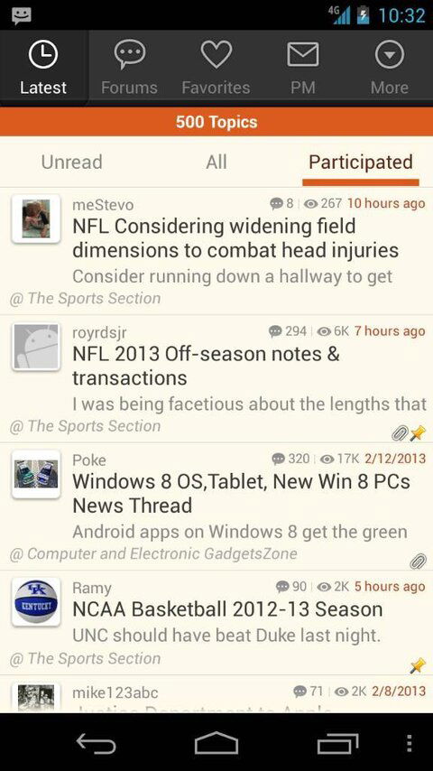
 
The only thing that makes it look cluttered to me is the ad. Everything else can be useful. I really like the "latest" tab and the "participated in" feature. It allows me to quickly get in and see all my new responses from multiple areas of the site.


Posted Using The New SatelliteGuys Reader App!
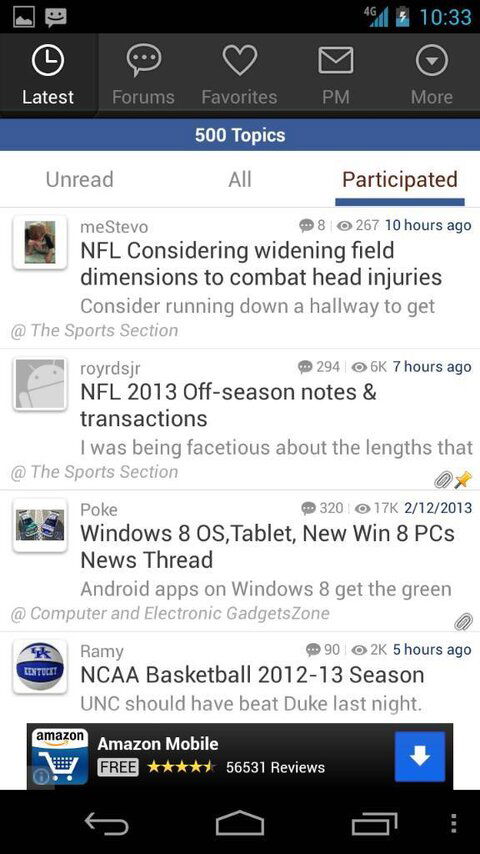
The font is bigger in the thread titles, making it look crammed, there are more tab links on the top, and the poster name, avatar image, and the number of posts are all cluttered on the same side.

Even more importantly, the new APP is much slower than the old APP
 
Some people will like the new app more, others will like the old app more, which is why we are keeping both for now. :)
 
For me it works on my iPad 2. The previous version was totally not useable. No issues with this latest update.
 
Some people will like the new app more, others will like the old app more, which is why we are keeping both for now. :)
I understand why people may like the layout and UI of the newer one. I personally prefer the UI on the older one, but that is not the main issue. The UI on both are not that much different. The issue I have is the performance. The new APP is just so much more slower than the older one. This is true on all my devices. I wonder if it has to do with the ads?
 
For me it works on my iPad 2. The previous version was totally not useable. No issues with this latest update.
The previous version what just updated yesterday and the issue with landscaping and the touch only work on 2/3 of the screen has been fixed.
 
The previous version what just updated yesterday and the issue with landscaping and the touch only work on 2/3 of the screen has been fixed.
Yep. That's what I experienced with the previous version in landscape mode, which is what I use 95% of the time.
 
Not sure, but the ads may come to the old one as well if we have to keep paying for two apps. Unfortunately this stuff is not free for us even though we give it free to everyone.
 
I am still curious as to why pictures in the Pub forums are showing up as broken links in BOTH apps?
 
Not sure, but the ads may come to the old one as well if we have to keep paying for two apps. Unfortunately this stuff is not free for us even though we give it free to everyone.
I completely understand and am very grateful for this site not only having its own APP, but two choices to choose from.

I am just making a simple comparisons and pointing out one noticeable difference on performance. Something that may need to be looked into.
 
Pics in Pub Member area working fine on my iPhone 5 and my wifes iPhone 4S. But it is not working for me on the new App on my iPhone 5 or her iPhone 4S, but it is working with the new app on the Kindle Fire.

Strange huh?!
 
Look how much less cluttered and cleaner the original APP is.

New APP
View attachment 85361

Old APP
View attachment 85362

Sent from my Jailbroken iPhone 5 using SatelliteGuys

I think the problem is just as much the resolution and design aesthetic of IOS apps as it is the app itself. You've got an entire row dedicated to the share and back buttons.
 
Status
Not open for further replies.

Users Who Are Viewing This Thread (Total: 0, Members: 0, Guests: 0)

Who Read This Thread (Total Members: 1)

Top