Actually Devonthink worked as it is supposed to, after a reboot! Makes sense. I had to do that yesterday with my bike app, which uses bluetooth to connect to a bike computer I use on my hand-bars. It stopped working and refused to connect after I upgraded to the iOS11-compatible software. Rebooted and all was back in order.
iOS 11
- Thread starter Scott Greczkowski
- Start date
- Latest activity Latest activity:
- Replies 346
- Views 31K
You are using an out of date browser. It may not display this or other websites correctly.
You should upgrade or use an alternative browser.
You should upgrade or use an alternative browser.
For iPhone or iPad?Some of the new features of 11 take some getting used to.
iPad definitely has a learning curve, but once you sort it out, you'll see how powerful it is.
The key for the iPhone is tweaking the control center apps you want to have on the swipe up.
I just wish didn't restrict the 'buttons' you can add. They picked the apps and it's take it or leave it.The key for the iPhone is tweaking the control center apps you want to have on the swipe up.
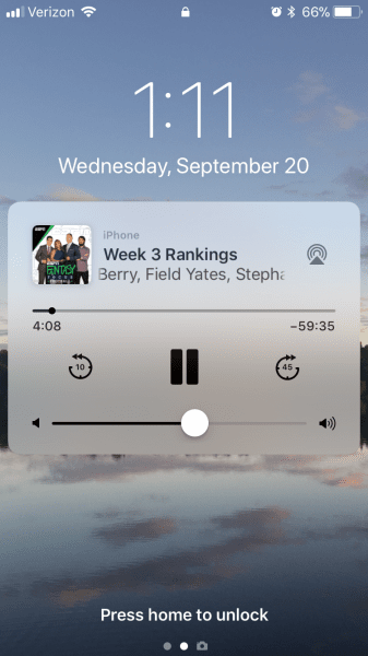
I like the new design so far. On the iPhone 6 most things are very similar to the way they worked before with a few visual changes. One thing I'm not a fan of is the audio playback widget when I am on the lock screen. At first I thought this was just a change Pocket Casts made in their most recent app update but it turns out that this is how all podcast and music apps work in iOS 11.
This is how podcast and music apps display on the lock screen in iOS 11. I took this screen shot with Pocket Casts running today.

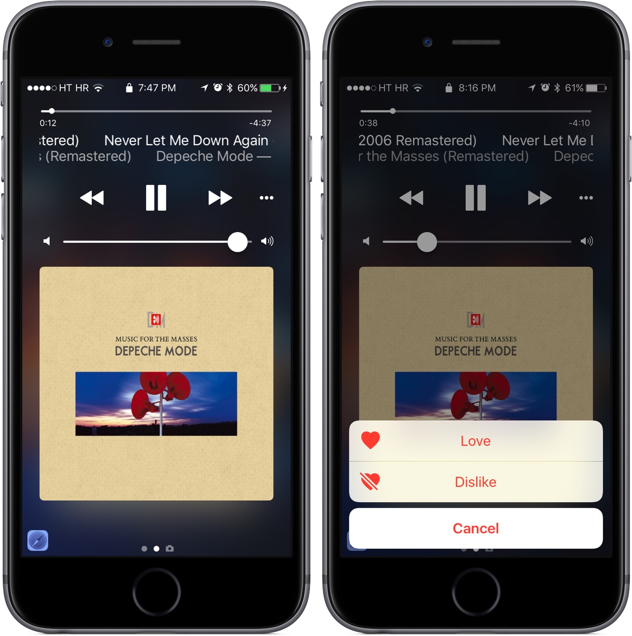
This is a random picture I got from Google Image search that shows how audio apps looked on the lock screen in iOS 10.

Functionally they do the same things so this isn't the biggest deal in the world but the way this looked in iOS 10 was much more appealing to me. Instead of filling up most of the screen with album art we get a widget with very tiny album art and most of the screen goes unused. Also the old version had much more room to display the text of what was playing. These two factors make it much harder to take a quick look at my screen and see what is playing while I'm trying to run on the treadmill at the gym. Again, this isn't some catastrophic change but I'm not really sure what the new system offers that is better than the old one. To me the old system looked nicer and was more useful.
This is how podcast and music apps display on the lock screen in iOS 11. I took this screen shot with Pocket Casts running today.
This is a random picture I got from Google Image search that shows how audio apps looked on the lock screen in iOS 10.

Functionally they do the same things so this isn't the biggest deal in the world but the way this looked in iOS 10 was much more appealing to me. Instead of filling up most of the screen with album art we get a widget with very tiny album art and most of the screen goes unused. Also the old version had much more room to display the text of what was playing. These two factors make it much harder to take a quick look at my screen and see what is playing while I'm trying to run on the treadmill at the gym. Again, this isn't some catastrophic change but I'm not really sure what the new system offers that is better than the old one. To me the old system looked nicer and was more useful.
For iPhone or iPad?
iPad definitely has a learning curve, but once you sort it out, you'll see how powerful it is.
The key for the iPhone is tweaking the control center apps you want to have on the swipe up.
iPad for sure. iPhone isn't too much of a learning curve. Stopping apps is the biggest change I see personally.
iPad for sure. iPhone isn't too much of a learning curve. Stopping apps is the biggest change I see personally.
Double clicking still works to bring up the task manager. My fingers are already trained to do that.
I imagine that more than a few were howling about how much bandwidth downloading the album art was consuming when operating without Wi-fi.Instead of filling up most of the screen with album art we get a widget with very tiny album art and most of the screen goes unused.
I imagine that more than a few were howling about how much bandwidth downloading the album art was consuming when operating without Wi-fi.
I'm pretty sure the full size album art is still downloading, at least in the apps I use. I use Pocket Casts as my podcast app. When I am in the app I see the full size album art just like I always did before. It's only on the lock screen where I see this microscopic album art.
The same thing goes for my music subscription service app of choice, Groove Music. In the app itself I still see the full size album art. On the lock screen it looks identical to that Pocket Cast screen shot I posted in my first image. Maybe the official Apple Music app and built in iOS Podcast app no longer download full size album art but the apps I use have it. Apple is just choosing to display it differently on the lock screen in iOS 11.
I did notice when my wife called while I was in my truck that her picture I have assigned to her contact displayed on my truck's radio screen. I thought that was cool.
I just wish didn't restrict the 'buttons' you can add. They picked the apps and it's take it or leave it.
There are a TON of options though. I find it really useful. It's my go-to for camera, timer, Apple TV remote, and on the iPhone flashlight. Works great.
AppleInsider reported that the behavior of Control Panel's WiFi and Bluetooth buttons have been modified.
Bluetooth & Wi-Fi can't be fully disabled via iOS 11 Control Center, Apple says
Here it is, straight from Apple: Use Bluetooth and Wi-Fi in Control Center with iOS 11
Bluetooth & Wi-Fi can't be fully disabled via iOS 11 Control Center, Apple says
Here it is, straight from Apple: Use Bluetooth and Wi-Fi in Control Center with iOS 11
Is it safe to assume that airplane mode turns them off for realz?AppleInsider reported that the behavior of Control Panel's WiFi and Bluetooth buttons have been modified.
I find it hard to imagine that they don't turn the radios off since this was one of the ways to extend battery life previously.
The toggles in the Control Center do not turn off WiFi and/or Bluetooth. They simply disconnect from the current connection.
Read the Apple articleI find it hard to imagine that they don't turn the radios off since this was one of the ways to extend battery life previously.
Garsh, I would hope so! According to the "Apple in their Infinite Wisdom" reasoning, the WiFi and Bluetooth button are used to disconnect devices, not shut off useful features like AirDrop, your AirPods, or your ?Watch. Airplane Mode, by its very name, MUST shut off all the radios.Is it safe to assume that airplane mode turns them off for realz?
I updated to iOS 11.0, so now that I see the Control Center and how the buttons react. When you press the individual radio buttons, they remove the background color but do not show a line through the icon. When you press the Airplane Mode icon, the background colors clear and a line appears through the icons to indicate the radio is off (except for the Cellular icon, it ghosts. Wonder what that's supposed to indicate?)
If you have to ask that question, we shouldn't be hoping or assuming.Wonder what that's supposed to indicate?)
What do you do to conserve as much power as possible when you're miles away from any Wi-fi or Bluetooth devices? Use another "adapter" in the form of a power bank?
It's an example of inconsistency that drives users bonkers. If they had ghosted all the radio icons, fine, or slashed all the icons, also fine. But this invites the supposition that maybe the cellular radio goes into a low-low-power mode that might allow position services (or GPS) while in Airplane Mode.
As far as what I use to extend battery life, I normally get through my day with over 50-60% left. I have a Lightning dock at work for days like today where I'm playing with my iPhone more than usual. . If I know I'm going to need to stretch it, I'll switch to Low Battery mode.
I also have an Anker 21,800 mAh battery with USB-C that will charge my MacBook Pro and any of my other USB devices while away from AC power.
As far as what I use to extend battery life, I normally get through my day with over 50-60% left. I have a Lightning dock at work for days like today where I'm playing with my iPhone more than usual.
I also have an Anker 21,800 mAh battery with USB-C that will charge my MacBook Pro and any of my other USB devices while away from AC power.
I agree about the consistency, or lack of. Also, what's with the colors (blue for BT and WiFi, green for cellular data) ? Why not the same color ?
It would be nice if a long-press on any of the buttons would take you to the real setting menu too so you could at least really turn them off/on as needed.
It would be nice if a long-press on any of the buttons would take you to the real setting menu too so you could at least really turn them off/on as needed.
Similar threads
- Replies
- 7
- Views
- 772
- Replies
- 117
- Views
- 10K
- Replies
- 0
- Views
- 700
- Replies
- 16
- Views
- 3K

