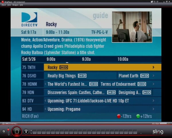
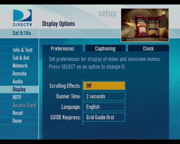
Overall not bad. Not major if you are used to using the HR20. The thing that jumps out at me is the use of alot more colors everywhere. White, multiple blues, fading, dark blue, really really white and very bright lettering. Some placement changes too. I am noticing a few things like HD capacity fill on My Playlist. I also like my Guide that shows my Favorite Filter selection.
HR20-700 CE Software Release CE0716 Coming
- Thread starter Scott Greczkowski
- Start date
- Latest activity Latest activity:
- Replies 69
- Views 7K
You are using an out of date browser. It may not display this or other websites correctly.
You should upgrade or use an alternative browser.
You should upgrade or use an alternative browser.
- Status
- Please reply by conversation.
I REALLY like the changes made at the info bar on the bottom in any screen, the color buttons are much better defined. That is important to show all 4 all the time. I'm red/green color blind, and when they didn't show all 4 buttons, I had no idea which one to hit.
Any word on if /when they are going to fix the Caller Id ?
I know it was not in the update list, but I tried it, just to check.
It use to come up "Unavaliable" of late, now it's not even doing that ...
I did check and the "Notifications are still "On" ....
Jimbo
I know it was not in the update list, but I tried it, just to check.
It use to come up "Unavaliable" of late, now it's not even doing that ...
I did check and the "Notifications are still "On" ....
Jimbo
Man that GUI is bright.
No issues to report right now. I guess I will see how th Family like it in the morning.
No issues to report right now. I guess I will see how th Family like it in the morning.
Looks good!
I hope to see more feedback here on this CE release. DirecTV is watching.
Speaking of DirecTV time for me to get outside and start installing my Dish.
I hope to see more feedback here on this CE release.
Speaking of DirecTV time for me to get outside and start installing my Dish.
Game Lounge on 110 still not active. Didnt see it on release but thought I would check.
You may activate the Game Lounge by putting Craig, Alaska in each of the 'My Cities' weather slots.
I downloaded it LATE last night, right at the end of the window.
I must say that with limited exploring, the interface is much better than the almost monochrome blue it was.
Logos "pop" at you. The GUI is fast and visually more appealing.
Adding the "Edge Cutter" features really makes good sense.
Now, it's on to the VOD !
I'll explore more and post as I discover more new / improved things !
Game Lounge on 110 still not active. Didnt see it on release but thought I would check.
Its working, go to Active, then Weather.
Once in Weather enter Crig Alaska in all 5 slots of My Cities, and then you will have the Game Lounge.
Its working, go to Active, then Weather.
Once in Weather enter Crig Alaska in all 5 slots of My Cities, and then you will have the Game Lounge.
Yes this does work!
can you only get the game lounge if you downloaded the cutting edge release?
------------------------
That would be my question as well........it appears that the "trick" to get it going
on the HR-20-700, is a back door thing, not enabled in a Nat'l release...I wonder
what happens if you sign up for a sub to it and they "kill" the backdoor??
well, i got something on the channel but forgot, i don't have a phone line hooked to the hr20. will try again and report back.
ok keeps telling me authorizing, one moment please.....then i get an error message.
check my phone connection and it says its ok.
check my phone connection and it says its ok.
okay, it will let you play the free trial games. but i guess it won't let you subscribe until the national release. i just played mini-golf!
Its working, go to Active, then Weather.
Once in Weather enter Crig Alaska in all 5 slots of My Cities, and then you will have the Game Lounge.
Worked for me. Thanks
- Status
- Please reply by conversation.
Similar threads
- Replies
- 85
- Views
- 11K
- Replies
- 53
- Views
- 8K
- Replies
- 28
- Views
- 6K


