Questions from a Dish Customer thinking about going to Direct.
- Thread starter jericko
- Start date
- Latest activity Latest activity:
- Replies 33
- Views 4K
- Status
- Please reply by conversation.
I've had both at the same time and now only Direct. The hardware is night and day from when I had Direct the first time. I have two Hr24 and a H24 now. Have not missed the VIP from Dish at all. Very responsive. I'm hooked on the MRV also. I'll never go to a provider without it.
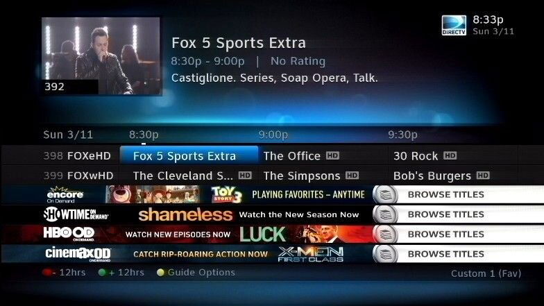
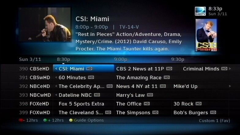
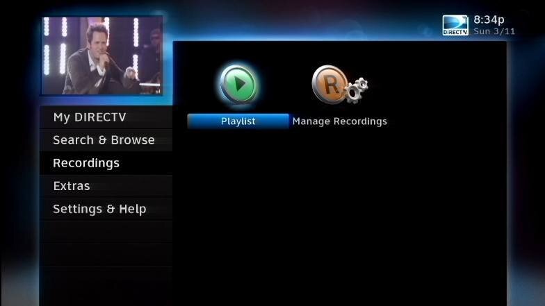
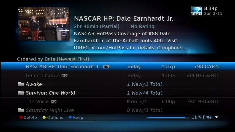
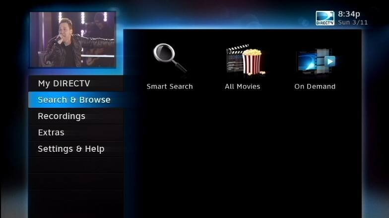
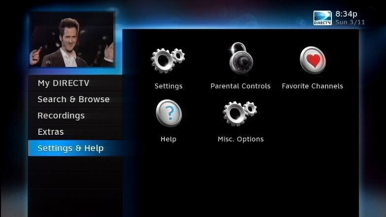
Here is what the GUI looks like... View attachment 75028View attachment 75029View attachment 75030View attachment 75031View attachment 75032View attachment 75033
WOW! Thank you very much!
Fyi ... I watch Dish more than Directv, both have plus & minus's (glad I can afford both for that reason) PQ, Sports & 3D go to Directv... Content & usability (although Directv is very, very close) go to Dish, I activated MRV with Directv a couple of weeks ago or so, had it with Replays years ago (Replay was bought by Directv) it really rocks!
Fyi ... I watch Dish more than Directv, both have plus & minus's (glad I can afford both for that reason) PQ, Sports & 3D go to Directv... Content & usability (although Directv is very, very close) go to Dish, I activated MRV with Directv a couple of weeks ago or so, had it with Replays years ago (Replay was bought by Directv) it really rocks!
Don,
Are both your D* and Dish equipment on the same TV set up ?
That kind of sucks. I've really grown to like the three hour guide on my 722k. In fact when I was installing (only on HD TV's) I used to ask the customer which they like better, and 99% choose the three hour guide. About the only ones who didn't where elderly who found the smaller type hard to read.
This is the one big ding I have with the Direct GUI... .. don't care how pretty/ugly it was....I found 3 hours much more functional/beneficial.
I have an H20 in my living room other wise yes.Don,
Are both your D* and Dish equipment on the same TV set up ?
Interesting reading about the GUI's. My parents have Dish and I've always hated the look of it and the menu system is just horrible. They still can't figure out how to do some things on the DVR. I have to show them sometimes and it's hard for even me to remember. Major pain. My experiences with DirecTV were better, and I've never had any trouble with any other DVR's which just "make sense" unlike the Dish DVR's. DO like the three hour thing though.
This is the one big ding I have with the Direct GUI... .. don't care how pretty/ugly it was....I found 3 hours much more functional/beneficial.
1 tap on the right arrow fixes that issue.
From multi-room dvr standpoint, are the big differences more tuners on Direct but more capability (more than just pause) in remote rooms on Dish (assuming new hopper/joey)?
I have had dish and switch to directv a year and a half ago. I could not be happier. I feel that the boxes are a lot easier to use. like people have said if you think you will want more than one dvr get it now. i wish i had.
1 tap on the right arrow fixes that issue.
actually its several (3 more?) taps....
Having 3 hours displayed at a time is a feature valued by many, else it wouldn't get mentioned by so many who have had Dish.
I can understand some folks want bigger fonts .. but it could at least be a configurable option.
Last edited:
From multi-room dvr standpoint, are the big differences more tuners on Direct but more capability (more than just pause) in remote rooms on Dish (assuming new hopper/joey)?
more dvr capabilities
i think the directv units have more options for search, cast, upcoming, ect then dish
- Status
- Please reply by conversation.
Similar threads
- Replies
- 24
- Views
- 2K
- Replies
- 13
- Views
- 703
- Replies
- 19
- Views
- 1K
- Replies
- 13
- Views
- 2K


