When are they going to start rolling out the promised new user interface? I haven't heard a word since the initial announcement.
What's the status on the Hopper guide update?
- Thread starter austinmm6
- Start date
- Latest activity Latest activity:
- Replies 65
- Views 18K
You are using an out of date browser. It may not display this or other websites correctly.
You should upgrade or use an alternative browser.
You should upgrade or use an alternative browser.
Soon...
No hurry as far as I'm concerned. I'm happy with the current interface and just hope they don't release the new one until it's thoroughly debugged.
No hurry as far as I'm concerned. I'm happy with the current interface and just hope they don't release the new one until it's thoroughly debugged.
The new "carbon UI" should be coming when dish releases the 4K joey along with the sydney and melbourne remotes is my guess.
I hope they don't do what they did in 2012 and release a SW that doesn't have anything implemented, or they have to rewrite code altogether. If they make it useable on release, then I will be a happy camper.
From what I am hearing they are rewriting a lot of it for performance increases. Can't wait to see it myself. 
It's the excitement of the summer. Also, if that is the case, we need lives. Lol.From what I am hearing they are rewriting a lot of it for performance increases. Can't wait to see it myself.
Soon...
No hurry as far as I'm concerned. I'm happy with the current interface and just hope they don't release the new one until it's thoroughly debugged.
I'm excited for the new look as we don't plan on staying with Directv . Not complaining on their pq but the Hopper with sling hands down trumps the Genie.
PLEASE let it be delayed indefinitely!
C'mon, you afraid of change?!?
...as long as it's a solid, reliable interface with user-centric features. Personally, excited because none of us know for sure what the final release will be like (unless on the inside with Dish). Glad the early automobile creators didn't say "it's working just fine, let's keep the design as it is!"
That is exactly what I wish they did since about 2004ish when that new mustang came out, and challenger and all the other screwed up designs.C'mon, you afraid of change?!?
...as long as it's a solid, reliable interface with user-centric features. Personally, excited because none of us know for sure what the final release will be like (unless on the inside with Dish). Glad the early automobile creators didn't say "it's working just fine, let's keep the design as it is!"
Was more around 2007-08, and I think the Challenger was the truest to the original, and like it a lot. Seriously considered buying one.That is exactly what I wish they did since about 2004ish when that new mustang came out, and challenger and all the other screwed up designs.
Was more around 2007-08, and I think the Challenger was the truest to the original, and like it a lot. Seriously considered buying one.
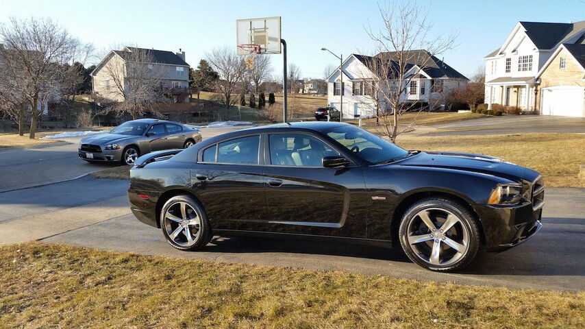
Totally off topic know(!!) Agree on the Challenger, go get one. Charger took me a while to get used to, but own two. I just live in the memories of the original... View attachment 107074
Attachments
That may be correct... I was in Iraq during pretty much that entire period, and when inwasntnin Iraq I was in Germany. Lol. I can't stand any of them, I think they look fake. However, if I were to buy one, I will agree that the challenger looks the truest to the original and is the best looking out of them all. Personally, I just want a metal car again. 15 mph and $.85/gallon.
They do better with software than Directv, so I am not worried. If this was Directv doing another re-write I'd start drinking now.
Very Nice!Totally off topic know(!!) Agree on the Challenger, go get one. Charger took me a while to get used to, but own two. I just live in the memories of the original... View attachment 107074
Either on Netflix or Amazon Prime, there is a show called Alcatraz that was on Fox about 4 years ago. The final episode featured a shot by shot, edit by edit, same location chase scene from "Bullit" with a current Mustang and Charger.
Last edited:
I much preferred the colors of the 922. The current Hopper colors are too washed out. The guide is harder to distinguish and harder on the eyes than the 922 darker colors for the guide. Interesting that Dish will be returning to the darker colors for the new UI and guide. Hey, I even preferred the guide and menu colors of the old 721 to the Hoppers of today. But I admit, I don't like the "flat design" so many are copying from the mobile displays for non-mobile displays like the forthcoming update for Hoppers from Dish.
I am curious, what do you mean by flat display.I much preferred the colors of the 922. The current Hopper colors are too washed out. The guide is harder to distinguish and harder on the eyes than the 922 darker colors for the guide. Interesting that Dish will be returning to the darker colors for the new UI and guide. Hey, I even preferred the guide and menu colors of the old 721 to the Hoppers of today. But I admit, I don't like the "flat design" so many are copying from the mobile displays for non-mobile displays like the forthcoming update for Hoppers from Dish.
Similar to the latest version of iOS. The on screen buttons and boxes aren't designed with any perceived dimensionality. It gives the interface a much flatter appearance.I am curious, what do you mean by flat display.


