Nice. Thanks.Click the little down-arrow next to the person's name. Actually, you don't even have to click it, just mouse-over it.
Welcome Home!
- Thread starter Scott Greczkowski
- Start date
- Latest activity Latest activity:
- Replies 97
- Views 8K
You are using an out of date browser. It may not display this or other websites correctly.
You should upgrade or use an alternative browser.
You should upgrade or use an alternative browser.
- Status
- Not open for further replies.
Thanks!No one notice that yesterday I darkened things up when reading messages... No more bright white behind the messages and also changed the text from grey to black.Much easier on the eyes.
(Yeah I got to change the quote box to the same color, just haven't found that yet.)
Lol, I actually did notice that earlier today, and was waiting to see if anyone else said anything.No one notice that yesterday I darkened things up when reading messages... No more bright white behind the messages and also changed the text from grey to black.Much easier on the eyes.
(Yeah I got to change the quote box to the same color, just haven't found that yet.)
Click the little down-arrow next to the person's name. Actually, you don't even have to click it, just mouse-over it.
There's also a 'Collapse user info in posts' setting in the Preferences section where you can set it so the info is always showing.
Thank you, I just found that and did an un-collapse!There's also a 'Collapse user info in posts' setting in the Preferences section where you can set it so the info is always showing.
I didn't notice it because I had already changed the Style to SatelliteGuys 2016. I'll have to check out your new darker version. Thanks!No one notice that yesterday I darkened things up when reading messages... No more bright white behind the messages and also changed the text from grey to black.Much easier on the eyes.
(Yeah I got to change the quote box to the same color, just haven't found that yet.)
EDIT: I think that the darkened version is a nice improvement! I know that it is a personal choice, but I would like to see that scheme used on the 'list of threads' pages as well.
Last edited:
I will keep poking and prodding at it. Just got a little busy at the real job, so haven't touched anything since yesterday.
There's also a 'Collapse user info in posts' setting in the Preferences section where you can set it so the info is always showing.
That's awesome...never realized that option was there!
Hey Scott, with the new set up ... is there a way to know if another person is Online when going thru the threads ?
Hey Scott, with the new set up ... is there a way to know if another person is Online when going thru the threads ?
It appears that a little green corner frame is on the upper left corner of the avatar if the person is online.
Correct and it's been there for some time. It's not obvious what it means though from just looking at it or seeing it there. That said, if you point at it -- and I realize many people wouldn't do that -- it does say "Online Now".It appears that a little green corner frame is on the upper left corner of the avatar if the person is online.
Thanks, I realized that after the fact, for some reason I was not seeing ANYONE on ... thought that pretty odd.It appears that a little green corner frame is on the upper left corner of the avatar if the person is online.
Just wanted to drop in and say congratulations on the big new site design roll out! I know that's no small task. I think it looks great!
After using the new board layout for a while now, I really like that all the Dish Network threads are consolidated into one forum. It is much easier to browse the Dish Network forum without having to mess with all the sub-forums, and with one forum, I don't miss out on any of the Dish discussions. Much better this way!
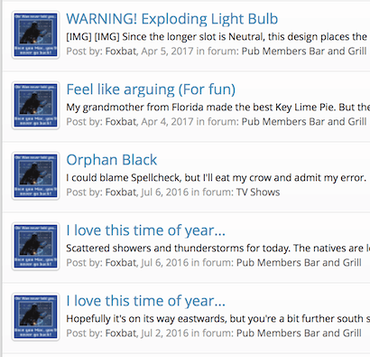
Hey, Scott, I was going to create a new thread, but I thought it could be part of the Site Upgrades. I went to look at My Content, and there is a big date span missing from April 4 of this year back to June of last year.
Maybe it's just an Index that needs to be rebuilt?
Maybe it's just an Index that needs to be rebuilt?
(added what I see when I search My Content)Hey, Scott, I was going to create a new thread, but I thought it could be part of the Site Upgrades. I went to look at My Content, and there is a big date span missing from April 4 of this year back to June of last year.

Maybe it's just an Index that needs to be rebuilt?
- Status
- Not open for further replies.
Similar threads
- Replies
- 82
- Views
- 3K
- Replies
- 92
- Views
- 3K
- Replies
- 18
- Views
- 3K
- Replies
- 40
- Views
- 7K
- Replies
- 49
- Views
- 6K

