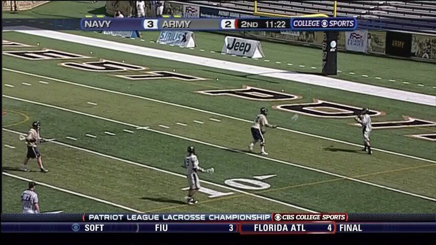
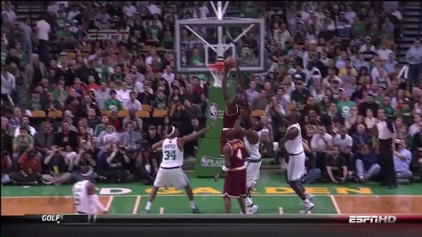
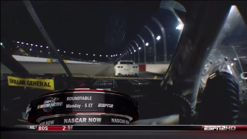
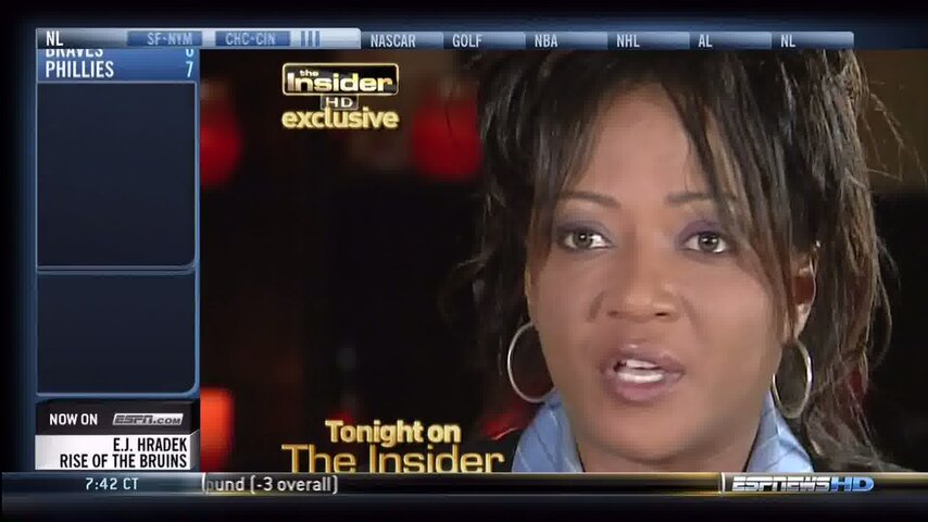
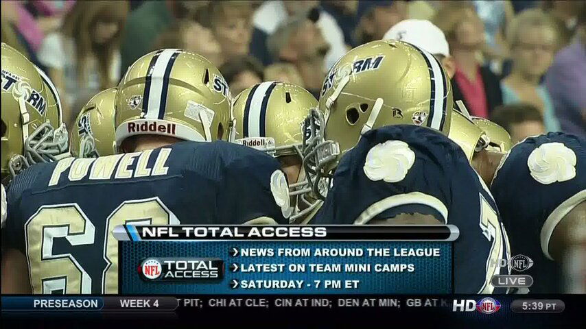
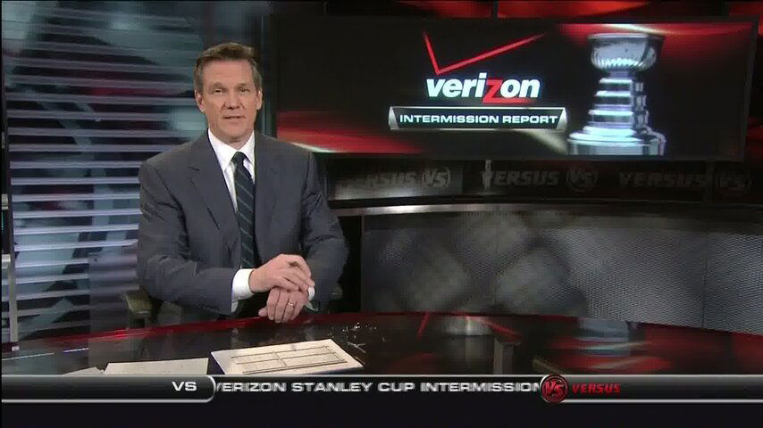
Is anyone else bothered by the tickers that have become standard on the bottom of the screen of all sports networks? I consider it to be wasted space that covers valuable real estate on the screen. I didn't mind when ESPN used to cycle through the scores 2-3 times per hour, but now it is a constant ticker. I'm sure a lot of people think it is convenient to see the other scores at any time, so maybe I'm in the minority, but I miss the days of an uncluttered screen. It is made even worse when there is a banner at the top of the screen for the current game and another one at the bottom for other scores. I wonder if there is any technology on the horizon that would allow networks to broadcast an "on demand" ticker that could be turned on or off based on user preferences, or do I just have to learn to live with more and more graphics on my screen?
Sports tickers on TV channels
- Thread starter CubsWin
- Start date
- Latest activity Latest activity:
- Replies 27
- Views 5K
You are using an out of date browser. It may not display this or other websites correctly.
You should upgrade or use an alternative browser.
You should upgrade or use an alternative browser.
I wonder if there is any technology on the horizon that would allow networks to broadcast an "on demand" ticker that could be turned on or off based on user preferences, or do I just have to learn to live with more and more graphics on my screen?
That is an EXCELLENT idea!!! :up
I agree that it's annoying to have these tickers take up valuable screen real estate. But at the same time, it would be nice to have a widget on your remote for scores.
I agree
Whats worse is on like ESPN Classic when they show an old game they put the ticker up but leave the screen as is....so you miss the bottom of the screen info
MLB Net does it right when it comes to that
Whats worse is on like ESPN Classic when they show an old game they put the ticker up but leave the screen as is....so you miss the bottom of the screen info
MLB Net does it right when it comes to that
on the same subject, what the hell happened to ESPN Sportscenter?
Now you have to realize I hadnt seen Sportscenter in probably 4 years. I had Canadian TV and Sportscentre from TSN is different. They only have a small bottom line
Fast forward to when I got D* a couple months ago....first day I turn on ESPN in the morning to see something amateurish on my screen that they call Sportscenter. It reminded me of my weather subchannel I get OTA with crap down the left side and a bottom ticker. The actual programming on my 42" TV looks like a 20" TV....I shutter what it looks like on a smaller TV.
Do we really need to know what they're going to talk about next?
Dont even get me started on what they talk about. I've seen it maybe twice since then. For MLB scores/hilites I watch MLB Network and NHL Network for the NHL. I could care less about the NBA and it seems like thats all ESPN talks about
on the same subject, what the hell happened to ESPN Sportscenter?
Now you have to realize I hadnt seen Sportscenter in probably 4 years. I had Canadian TV and Sportscentre from TSN is different. They only have a small bottom line
Fast forward to when I got D* a couple months ago....first day I turn on ESPN in the morning to see something amateurish on my screen that they call Sportscenter. It reminded me of my weather subchannel I get OTA with crap down the left side and a bottom ticker. The actual programming on my 42" TV looks like a 20" TV....I shutter what it looks like on a smaller TV.
Do we really need to know what they're going to talk about next?
Dont even get me started on what they talk about. I've seen it maybe twice since then. For MLB scores/hilites I watch MLB Network and NHL Network for the NHL. I could care less about the NBA and it seems like thats all ESPN talks about
Thank you!!! This drives me CRAZY!!!
I don't mind this happening on the SHOW that uses it as a staple, but now it seems everyone has adopted this, I hope it ends soon ....
The only problem with MLBNet is that they tend to squish the picture to fit above the ticker. This cause a slight distortion, not bad, but very slight. I can tell when they are showing a live game of another RSN feed. When I switch directly to the RSN feed the picture is not as squished.I agree
Whats worse is on like ESPN Classic when they show an old game they put the ticker up but leave the screen as is....so you miss the bottom of the screen info
MLB Net does it right when it comes to that
ESPN always puts NBA and NFL above all else. MLB and NHL take a second seat.on the same subject, what the hell happened to ESPN Sportscenter?
Now you have to realize I hadnt seen Sportscenter in probably 4 years. I had Canadian TV and Sportscentre from TSN is different. They only have a small bottom line
Fast forward to when I got D* a couple months ago....first day I turn on ESPN in the morning to see something amateurish on my screen that they call Sportscenter. It reminded me of my weather subchannel I get OTA with crap down the left side and a bottom ticker. The actual programming on my 42" TV looks like a 20" TV....I shutter what it looks like on a smaller TV.
Do we really need to know what they're going to talk about next?
Dont even get me started on what they talk about. I've seen it maybe twice since then. For MLB scores/hilites I watch MLB Network and NHL Network for the NHL. I could care less about the NBA and it seems like thats all ESPN talks about
ESPN always puts NBA and NFL above all else. MLB and NHL take a second seat.
It makes sense for them to put the NFL ahead of the others, but basketball does nothing for them.
They probably do this because they have contracts with both of them.
It makes sense for them to put the NFL ahead of the others, but basketball does nothing for them.
They probably do this because they have contracts with both of them.
Well that, and it is playoff time, so more hype to get more NBA viewers to watch them.
It use to be that ESPN did not run a ticker except for the top and bottom of the hour.
espn2 ran a ticker at the bottom all the time.
Now I see, ESPN is running the ticker all the time as well.
I don't mind it at the top and bottom, but find it very annoying all the time.
Wonder if ESPN did /does any surveys about such a thing.
espn2 ran a ticker at the bottom all the time.
Now I see, ESPN is running the ticker all the time as well.
I don't mind it at the top and bottom, but find it very annoying all the time.
Wonder if ESPN did /does any surveys about such a thing.
Ticker:
I'm used to it, but would certainly would not miss it. The DirecTV "red button content" is probably a proto version of what will come. Someday the viewer will be able to choose what will show up in the ticker, if he chooses to have one at all.
I don't like the mix ESPN uses. I, like 99.9999% of Ameircans have only a vague idea what EUFA is, and don't care if "Inter" beat "Real" in a titanic 1-0 a**kicking. Also the words "Northeast Nebraska Tech State Community women's volleyball coach ..." are always followed by "was killed" or "was fired". Sorry for her family, but not national news. There are days (Super Bowl, Christmas, etc) where there is not much going on, and the ticker does not need to scrape the bottom of the barrel for news.
Lastly, I'm sorry, but grow up ESPN. Look, the World Series is on Fox, not "ESPN Radio".
SportsCenter:
Too much NBA. ESPN's SC and talkshow (PTI, Cowidiot, ATH, Sports Reporters, etc) coverage of the NBA, if expressed as a ratio of its actual ratings is off the scale too high relative to every other sport. Further, and this goes for all media, quit it with the first names. Look, the NBA is mostly blacks and eastern European whites, both of which groups, have many people with unique first names by US white standards (Lebron, Shaquile, Kobe, Sasha, etc) but these are grown men and in the most cases the scorereaders are not on a first name basis with them. I was raised to believe it was rude to call a grown man, especially a black man, by his first name, unless you were asked to by him and the person you a speaking to likewise is on a first name basis with him.
The tickers were fine when the simply showed scores, but with the explosion in popularity of fantasy sports, they now feel obligated to give every little miniscule statistic to placate all the gamers. That and it seems we need our daily Tiger Woods tidbit. Funny how they showed him in 121st place last weekend, but I never get to find out who is in 121st place during any other tournament.
At least they were good enough to show you that ....The tickers were fine when the simply showed scores, but with the explosion in popularity of fantasy sports, they now feel obligated to give every little miniscule statistic to placate all the gamers. That and it seems we need our daily Tiger Woods tidbit. Funny how they showed him in 121st place last weekend, but I never get to find out who is in 121st place during any other tournament.
They could have not mentioned it at all.
And you'd think that ESPN of all channels could go back to the scores at the top and bottom of the hour seeing they have a channel dedicated to scores already ....
ESPNEWS
ESPNEWS
ESPN needs to do more sports and fewer sit down comics. They really do not need Stone Temple Pilots or any other "musicians". If I want music I'll watch MTV. Fox also needs to lose the dancing robots, especially on their NFL telecasts. My not so humble opinion only.
Similar threads
- Replies
- 4
- Views
- 63
- Replies
- 5
- Views
- 785
- Replies
- 9
- Views
- 2K
- Replies
- 38
- Views
- 6K
- Replies
- 240
- Views
- 31K


