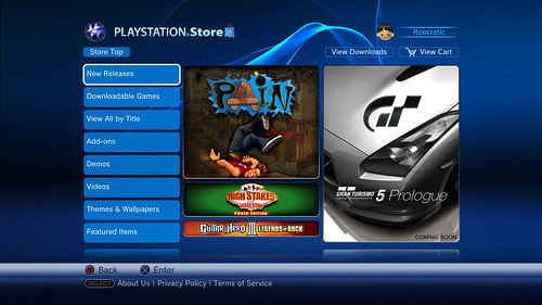
PlayStation Store Update!
- Thread starter IcEWoLF
- Start date
- Latest activity Latest activity:
- Replies 18
- Views 3K
You are using an out of date browser. It may not display this or other websites correctly.
You should upgrade or use an alternative browser.
You should upgrade or use an alternative browser.
Aye, a better version of the Xbox Live blade. Less clicks to get what I want... anything was better than what they had though 
havent dug around alot, but whats the "special" download when the store gets updated? alot of people think home 1.0 will be out.
Mid april had been the rumor for a while, before this update even.
Sony not saying 'no comment' but outright denying... so that means its got a good shot!
Sony Says No PlayStation Home With PS3 Firmware 2.30 : dBTechno
Doesn't mean they cant offer the download later in the day and therefore not lying...
PS3 Open Home Beta To Kick Off April 18th : dBTechno
Sony not saying 'no comment' but outright denying... so that means its got a good shot!
Sony Says No PlayStation Home With PS3 Firmware 2.30 : dBTechno
Doesn't mean they cant offer the download later in the day and therefore not lying...
PS3 Open Home Beta To Kick Off April 18th : dBTechno
Well I've just Installed it now, it looks great, it is very fast, much faster than xbox live marketplace.
I love it.
Sony hasn't uploaded any images & Icons yet, but I am sure within the next couple days all the contents images will be uploaded.
It looks sweet.
I love it.
Sony hasn't uploaded any images & Icons yet, but I am sure within the next couple days all the contents images will be uploaded.
It looks sweet.
It's faster because like the Marketplace its running off pages on the hard drive and querying for more data, instead of basically viewing a webpage on the screen. With the organization seen in the screen shots, looks like a home run. Will start it installing and play with it later.
Update: they started uploading images and pictures, they will add more and more pictures, I am sure by the end of the week we should see all the images for all categories and sub categories.
Now all we need is a better voice/text software, upgrade the current one, so its faster.
Overall I am happy with my PS3.
Now all we need is a better voice/text software, upgrade the current one, so its faster.
Overall I am happy with my PS3.
check out the browser, that thing is going a TON faster now, and you dont have to click "do you want to run the plugin" anymore 
OH YEA!!I really like the new store, now bring on Metal Gear Solid Online!
 :
:I really like the new store, now bring on Metal Gear Solid Online!
They are giving out beta's out!
They are giving out beta's out!
I have mine reserved since Jan. So i got a dvd just to make sure I could do the online beta...I think the more people on there the better!
It seems stupid to leave squares blank while things are loading. There should be default graphics for demo, theme, background, video, etc that are there prior to the image loading. There should be a text alternative of all of the images it's loading too. Instead of squares, let us view a list (a la Live). The system knows it's there (you can move to them and see the name prior to it loading), it's just sitting there lagging downloading images. Sure you only need to load them once, but you have x million people experiencing this, and just these small 'features' would have gone a long way to improve first impressions. The load times for the little icons make it feel sluggish. If the prior store were never seen and this were the first one, I think we'd be a lot more critical of it.
Home delayed again... open beta now 'this fall'
Sony pushes Home open beta out until fall '08, closed beta extended - Joystiq
Sony pushes Home open beta out until fall '08, closed beta extended - Joystiq


