Hopper 2K S423 Joey S362 Software Update

I don't know if this is new or if I just hadn't noticed it in older versions, but rapid presses (or maybe holding down) of the 30 skip forward key increase the amount skipped:

30 sc. then 1m then 1m. 30sc.

Gets you through commercial breaks in two or three presses. I'm not sure if this was really needed, the response time of the 30 sec. presses is so instant that I can't imagine it making it that much better. But I'm sure once I get used to I won't want to go back.

I don't think it literally starts jumping more and more with each rapid press. In other words, the UI is simply adding up the 30-second skips. e.g. Four rapid presses would be 30s + 30s + 30s + 30s = 2m as opposed to 30s + 1m + 1m30s + 2m = 5m
 
I don't think it literally starts jumping more and more with each rapid press. In other words, the UI is simply adding up the 30-second skips. e.g. Four rapid presses would be 30s + 30s + 30s + 30s = 2m as opposed to 30s + 1m + 1m30s + 2m = 5m

Correct. Adds in the increments of 10 seconds for rewind and 30 seconds for forward. Still need to click forward 6 to 8 times to get past the commercials! ;-)
 
Menus

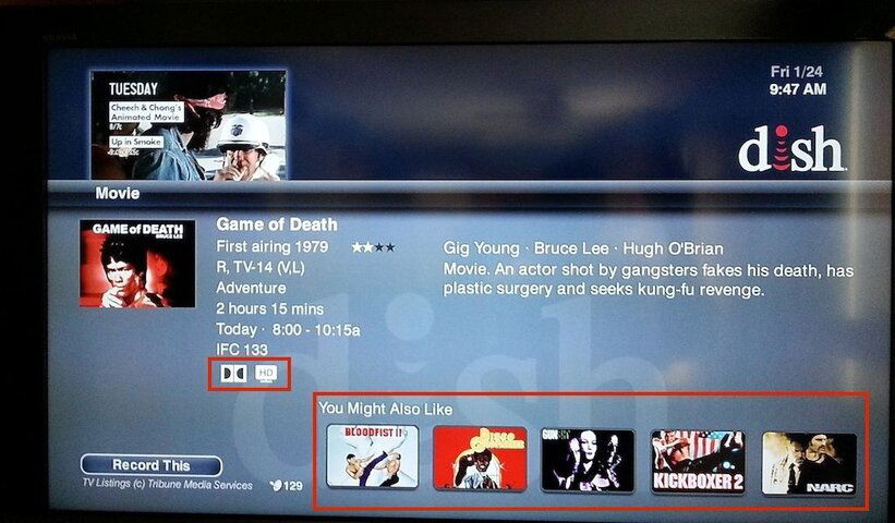
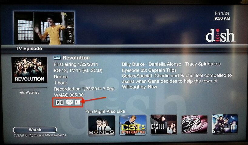
Have to say I do like the new menus in the update, even though Dish still did not fix a lot of the other problems we've been discussing. Took all the little icons off the large show icon and added the icons in one neat row, with the New icon next to the show's name. Put the Saved icon back but not on the main menu list of icons. Fail.

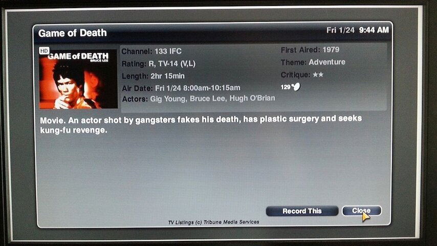
Old Info Screen:
Menu-Old.jpg


New Info Screen:
Menu-New.jpg 334 Recordings 2.jpg


You can also select one of the 'might likes' and press the info button for that to change to that show's details. You can go on forever this way if you ever get bored. They did remove the 'Close' button. Not a big loss as you always could just click the Cancel button on the remote.
 
Last edited:
Yeah it's not bad, but I really would like the Protected/Saved icons back on the lists. Plus I would like for them to fix the search.
 
Hate the new info screen. Cluttered up with useless "you might also like". So much crap on the page that it truncates the descriptions (which is what the info page is for) if they are over a couple of lines. I already know what I like and what I want to watch.
 
Anybody checked to see whether the new Joey software fixes the problem reported here about not being able to view recordings from channels you no longer subscribe to?
 
Well my H2K got the update last night.
it seems to have fixed my EHD woes. I chose a few dozen shows and a couple dozen movies and started a transfer. After an hour it was still counting down sit clearly got past the 5 second glitch on the first show transferred. I also was able to scrowel down to the last movie in the list rather than being limited to the top 20%.
I guess by next week I will be able to return my old Hoppers and hook up my new HWS.
have not had time to look at anything else yet, but happy about EHD fix and surprised it was not even mentioned on the splash screen for the update.
 
Put the Saved icon back but not on the main menu list of icons. Fail.

Yeah it's not bad, but I really would like the Protected/Saved icons back on the lists.

Not a big fan of the new info screen. The new saved/protected icon's new location is better than nothing I suppose, but I'd still rather have it back where it WAS, as well. I don't get the "improvement" in taking something that was useful at a quick glance, and moving it such that you have to do multiple button presses to now find same info. :tsk:
 
I like the new info screen but I had hit info on a show in my guide and one of the recommendations was Criminal Minds. Well there was no box art for Criminal Minds (which I thought was weird) so I clicked on it and was lead to the info screen for a documentary called Corazon

I can't remember the movie I originally received Criminal Minds (but really Corazon) as a recommendation but I found a program that gives the same recommendations.

Without a Trace
Tues 1/28 2:00 - 3:00 am
ION 216
 
Have to say I do like the new menus in the update, even though Dish still did not fix a lot of the other problems we've been discussing. Took all the little icons off the large show icon and added the icons in one neat row, with the New icon next to the show's name. Put the Saved icon back but not on the main menu list of icons. Fail.

Old Info Screen:
View attachment 94848


New Info Screen:
View attachment 94849 View attachment 94850


You can also select one of the 'might likes' and press the info button for that to change to that show's details. You can go on forever this way if you ever get bored. They did remove the 'Close' button. Not a big loss as you always could just click the Cancel button on the remote.

Thanks for info and pics and updates!! I like what I see so far but haven't got the update yet for Hopper w/ Sling of Joey and now I know what to expect and it will get here Soon and I will be patient with it!! :)
 
The annoying audio drop-outs on local channels remains. I'm watching considerably less OTA network content as a result. Not good for the long term retention prospects for this subscriber.
 
The themes search is still missing a "by time" sort option that was available up to 330 SW changes. If your looking to watch a program right now, the alphabetic result is not very convenient.
 
In the old info mode you had to hit the info button twice to see the satellite the program is on. Now it is available on the first click and the whole screen disappears on the second click. There is no semi transparent mode anymore.
 
We got new software this morning at 2:40. S424 for Hopper, S358 S451 for Joey. Yes, S424!

I'm getting it now I'm on dialog/warning 303 ... Your receivers memory is now being programmed. Do not disturb or unplug your receiver!

One thing I hate about the new info screen is tonight I watched the Burt Wonderstone movie and pressed info and the whole description of the program could not be read.
 
They did remove the 'Close' button. Not a big loss as you always could just click the Cancel button on the remote.

You can hit INFO a 2nd time to close it. Convenient if you didn't move your finger, browsing the "you may like..." stuff.

I do like the new INFO screen. I saw a post saying the episode's description can get cut off though. I only looked at 2-3 shows and they were fine...

Sent from my SCH-I535 using Tapatalk
 

League Pass

Users Who Are Viewing This Thread (Total: 0, Members: 0, Guests: 0)

Who Read This Thread (Total Members: 1)