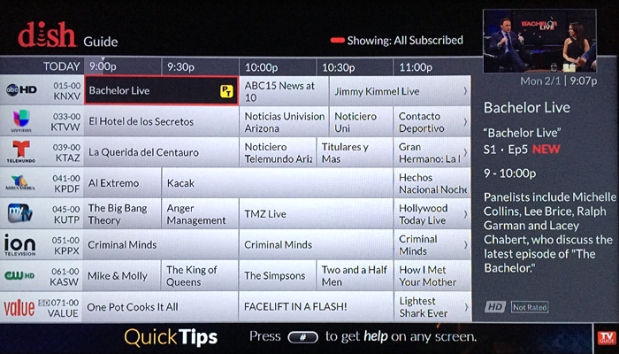
The Dish Network User Interface Thread

EchostarFan

SatelliteGuys Family
Original poster
Sep 26, 2017
52
54
Landis, North Carolina
Since I have seen the rise of the horrible CUI through new Hoppers and Joeys, and Wallys, I have decided to start a thread about the past and old Dish Network user interfaces, featuring the familiar blue UI on the VIP receivers that we all know and love, the old OpenTV Dish Interactive UI on earlier DishPro receivers (301 to 811), and the rare green UI on models 721 and 921 (which they had Linux in it!)

5-21-08-dish-guide.jpg
Remember this? The rare green 721 guide, taken October 18, 2003. Wow, memories!
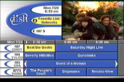
interactive-tv.jpg
Lots of memories with this common early 2000s Dish guide, it was the OpenTV Dish Interactive user interface that I was talking about!
vsm9dy.jpg
Finally, the 322 and the 522 that started it all...... the familiar VIP guide that we all know and love that we see on VIP receiver models!
It seems Dish may have come a long way, but with the CUI, they are going way backwards!
 
I remember the little Linux penguin that would pop up as the 721 booted. The 3900/4900 would ship with the old 3700/4700 software and update as soon as you connected them. I can't find a screenshot for the original turquoise menus.
 
The old UI was easier on my eyes. I had no problem at all with it . Now it seems almost all tv providers are using such a dark guide . Dish calls it carbon. Comcast is the same dark display. And from the adds I see so is Direct . Glad my 922 works great.
 
I really liked the Webtv /Dishplayer 7100 /7200 model receivers back in 99 when they first came out. They were so cool....till the Microsoft - DISH war started. Then I went through like 6 boxes before I gave up on them and got the 501 PVR when it came out. No PVR fees at all and I owned it after my new commitment was up.
 
I really liked the Webtv /Dishplayer 7100 /7200 model receivers back in 99 when they first came out. They were so cool....till the Microsoft - DISH war started. Then I went through like 6 boxes before I gave up on them and got the 501 PVR when it came out. No PVR fees at all and I owned it after my new commitment was up.

I also had a Dishplayer and I thought it was way ahead of it's time for 1999. Really loved it.
 
This is kind of off topic for this thread, but this is the first EPG that I ever used, the GI DSR-920 4DTV, circa 1997. I think it looks pretty good for 20 years ago. I always liked the GI EGP because it sorted the guide by color for the different genre of programming. I think that some of the Hughes units that DirecTV/USSB had did that, and of course the DSR series used by StarChoice/ShawDirect in Canada (GI/Motorola/Arris makes their receivers).
4dtv.jpg
future.jpg
 
This is kind of off topic for this thread, but this is the first EPG that I ever used, the GI DSR-920 4DTV, circa 1997. I think it looks pretty good for 20 years ago. I always liked the GI EGP because it sorted the guide by color for the different genre of programming. I think that some of the Hughes units that DirecTV/USSB had did that, and of course the DSR series used by StarChoice/ShawDirect in Canada (GI/Motorola/Arris makes their receivers).
View attachment 129886 View attachment 129887
Cool! That was like the dreaded carbon guide, but done right in the 90s!
 
This is kind of off topic for this thread, but this is the first EPG that I ever used, the GI DSR-920 4DTV, circa 1997. I think it looks pretty good for 20 years ago. I always liked the GI EGP because it sorted the guide by color for the different genre of programming. I think that some of the Hughes units that DirecTV/USSB had did that, and of course the DSR series used by StarChoice/ShawDirect in Canada (GI/Motorola/Arris makes their receivers).
View attachment 129886 View attachment 129887
I'll go off topic with you.

Before I got my first Dish receiver (the late and, yes, greatly lamented DishPLAYER 7100) I had a marvelous box from StarSight. It was a set-top box with an onscreen guide with dinky links to get your cable box and vcr to change channels, set record etc.

Starsight.jpg


I think it finally got gobbled up by TV Guide/Gemstar, but I also seem to recall that the box my DP 7100 came in was covered with various company and Channel logos...including the StarSight logo. So I imagine they supplied the GUI/Guide for the Dishplayer at that time. (and maybe all of Echostar's receivers)

Uniden had a line of C-Band receivers about 1995-97 or so that had a built in StarSight guide. I don’t remember if they ever had a standalone box for C-Band or not. As far back as 1984-85 (if I remember correctly) OnSat had an early version of an EPG called SuperGuide, it was a separate box that you connected to your C-Band receiver. I believe that the data used to reside on the same transponder as WGN, I think it was supplied by Tribune. I never had it, so I don’t remember how many days out you could go. I don’t think it was in a grid, but more like an onscreen listing by channel. Kind of looked similar to teletext.
 
The old UI was easier on my eyes. I had no problem at all with it . Now it seems almost all tv providers are using such a dark guide . Dish calls it carbon. Comcast is the same dark display. And from the adds I see so is Direct . Glad my 922 works great.

You can change that to a light guide. Menu, Settings, Apperance, Classic
 
I still think that the 211/222/612/622/722 series UI is hard to beat. It is nothing fancy, but easy to read.

I don't dislike the Carbon UI, but sometimes I think that form has been placed above function in some cases.

I think it would be nice to have an option between the vip series ui and the new carbon ui. Or possibly a hybrid version.
 

New Remonte 54.0 question?

POP (117HD in test)