I must be the last person on the planet to get Hulu’s much-heralded new user interface. I mean seriously folks, they told me back in April to expect a new UI. So, I finally got it this week. In fairness I might have gotten it last week. Hulu has been a bit of a wasteland lately as far as I am concerned, so I haven’t used it a lot.
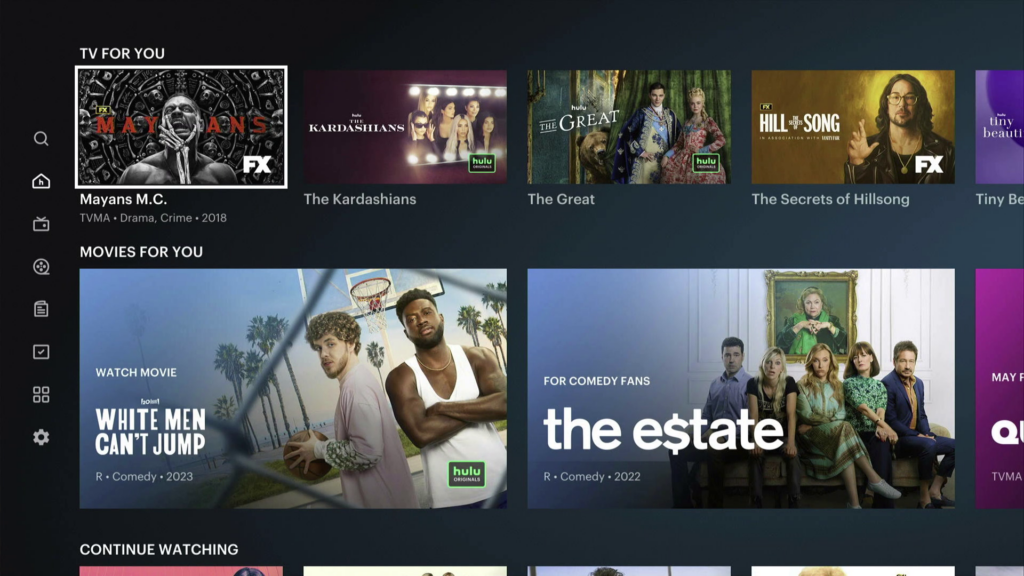
By now you’ve all seen it, so I’m not going to go into a review. I can’t resist posting one screencap, but that’s about it. I just want to document that I actually got the thing.

Hulu seems to have forgotten most of what it knew about me. It forgot about half the shows in my “Continue Watching” list. It thinks instead that I would like to watch… well you can see the list up top. Big swing and a miss, Hulu.
It also seems like it’s harder to even find the content I’m looking for. When I went to browse to find some of the content I had been watching, I couldn’t find it. A search got me there, eventually.
This is not the first app that has forgotten a lot about its users after a major update. I hardly need to remind any of you of the first couple days of the Max rollout. I think there probably were a lot of people who did have good experiences but you can certainly read a lot of bad ones too. And those bad ones carry a lot of weight on the internet.
See, I know I’ve said it before. Streamers had it pretty good in the ’10s. The money was rolling in and everyone wanted what they had. But slowly, the bloom went off the rose, as they say. Now it’s about managing costs so you don’t price yourself out of the market. And when that kind of competitive situation starts to arise, you need to innovate.
I think it’s smart of Hulu to keep trying to fix their user interface problems. They have certainly had a lot of them. I see nothing wrong with the design they’ve picked. Then again it’s identical to what pretty much everyone else is doing. The problem is in the little bits of execution that they got wrong. It doesn’t take much to ruin all the work they’ve put in, and I hate to say it Hulu — you’ve ruined things yet again.
It must be harder than it looks. I mean, all you have to do is make it easy for people to find what they want, while not insulting them with things they’ve shown they don’t want. Yet, Hulu, the former Discovery+, and others seem to keep whiffing it. Apps like Netflix have long abandoned any aspirations of being consistently good, and when it comes to Max… I’m willing to wait for the fixes and the good content but not for much longer.
Meantime, I’m going back to watching TV the old fashioned way, using a satellite dish and an antenna. Call me a curmudgeon, but it hasn’t let me down yet.
The post STREAMING SATURDAY: Great job, Hulu appeared first on The Solid Signal Blog.
Continue reading...
By now you’ve all seen it, so I’m not going to go into a review. I can’t resist posting one screencap, but that’s about it. I just want to document that I actually got the thing.

Here’s the problem
Hulu seems to have forgotten most of what it knew about me. It forgot about half the shows in my “Continue Watching” list. It thinks instead that I would like to watch… well you can see the list up top. Big swing and a miss, Hulu.
It also seems like it’s harder to even find the content I’m looking for. When I went to browse to find some of the content I had been watching, I couldn’t find it. A search got me there, eventually.
Not the first, and probably not the last
This is not the first app that has forgotten a lot about its users after a major update. I hardly need to remind any of you of the first couple days of the Max rollout. I think there probably were a lot of people who did have good experiences but you can certainly read a lot of bad ones too. And those bad ones carry a lot of weight on the internet.
See, I know I’ve said it before. Streamers had it pretty good in the ’10s. The money was rolling in and everyone wanted what they had. But slowly, the bloom went off the rose, as they say. Now it’s about managing costs so you don’t price yourself out of the market. And when that kind of competitive situation starts to arise, you need to innovate.
I think it’s smart of Hulu to keep trying to fix their user interface problems. They have certainly had a lot of them. I see nothing wrong with the design they’ve picked. Then again it’s identical to what pretty much everyone else is doing. The problem is in the little bits of execution that they got wrong. It doesn’t take much to ruin all the work they’ve put in, and I hate to say it Hulu — you’ve ruined things yet again.
It must be harder than it looks. I mean, all you have to do is make it easy for people to find what they want, while not insulting them with things they’ve shown they don’t want. Yet, Hulu, the former Discovery+, and others seem to keep whiffing it. Apps like Netflix have long abandoned any aspirations of being consistently good, and when it comes to Max… I’m willing to wait for the fixes and the good content but not for much longer.
Meantime, I’m going back to watching TV the old fashioned way, using a satellite dish and an antenna. Call me a curmudgeon, but it hasn’t let me down yet.
The post STREAMING SATURDAY: Great job, Hulu appeared first on The Solid Signal Blog.
Continue reading...

