Everything has to start somewhere. Today we take the idea of icons for granted. They’re part of our computers and phones and we all understand why. Sometimes they’re well-designed and sometimes they’re just pictures that kind of remind us what we’re doing. If they’ve been around long enough they can be really vague and still work. Want proof?

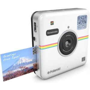
Remember this? It was the Instagram’s original logo. (Side note: remember when icons actually looked like a thing? Now they’re all just squggles.) It’s obviously a camera, although if you’re “of a certain age” you know it’s this particular camera.

Way back when, that camera meant fun, instantaneous images, and sharing. That’s what Instagram was shooting for.
Except, then Instagram got way more popular than Polaroid ever was and Polaroid (now owned by some weird Chinese company) actually started selling cameras that looked like the Instagram logo (kinda.)
So what did Instagram do? They redesigned their icon. To wit:

There’s no way anyone could make a camera that looks like that, not really. The only problem is that if you didn’t know it was a camera before, you sure weren’t going to grasp it now. I’m sure the people at Instagram don’t really care though.
Back in the early 1980s practically no one understood the idea of on-screen icons. To make matters worse, no one had color monitors and even black and white ones were pretty weak. The original Mac had a lower resolution for the whole screen than the resolution of a single icon today.
I’m not kidding. This is what the ENTIRE screen looked like.
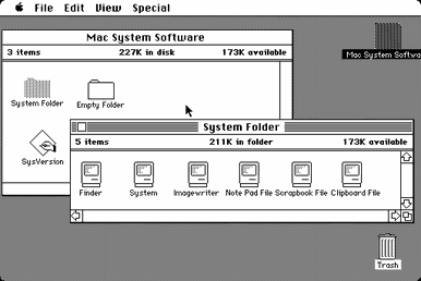
So if you were going to do icons for that, you had to be really clever. People didn’t know what they were looking at and you had practically no room for pictures so you had to work HARD.
And yet, they pulled it off. If you look at that screen, you see a trash can. You see a folder. You even see a little teeny Mac with its own little teeny icons, each precisely one pixel.
Specifically, it took the talent of this lady, Susan Kare, who is probably really peeved that this picture still exists.
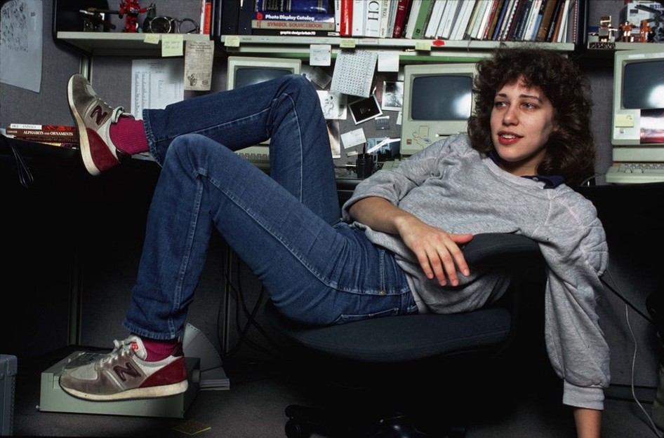
Ms. Kare was working at Apple on the Macintosh project and she was tasked with creating all these system icons, which turned out to be so awesome that they’re in museums now. I mean, look at these. With so little room, she makes stuff perfectly clear.
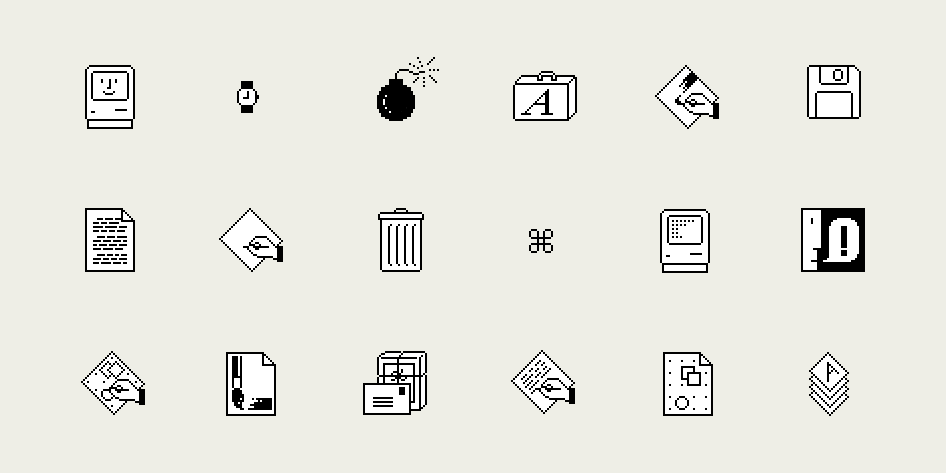
That takes talent. You know what else takes talent? Apparently she designed these things on GRAPH PAPER then translated them into long strings of numbers. She didn’t even have a visual editor since the computer that would run the editor didn’t exist yet.
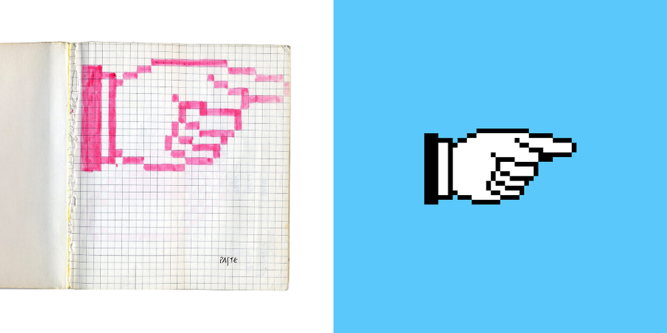
When I first heard about this, I wanted to learn more. I read an article originally at milanote about it. That article’s been taken down, but The Internet Archive still has a copy. I don’t want to ruin the surprise for you but here are two little takeaways:
Picking up the story for this article, I found a live article from Smithsonian that covers a lot of the same topics. I’m linking it here in case that other article is lost. And, because this is the 21st century and we’re all sort of connected, I found Susan Kare’s Linkedin page. She’s been busy since her days at Apple. In addition to having her own consultancy, she also worked for Pinterest for about six years. It seems she’s done work for industry giants like Meta and gotten a bunch of awards for her work.
I don’t have any illusions about anyone putting my work in a museum or using any part of it 50 years from now, but then again perhaps neither did she. Moral of the story: when you do your best work, sometimes it really does last forever.
The post FUN FRIDAY: Icons on graph paper? appeared first on The Solid Signal Blog.
Continue reading...
Remember this? It was the Instagram’s original logo. (Side note: remember when icons actually looked like a thing? Now they’re all just squggles.) It’s obviously a camera, although if you’re “of a certain age” you know it’s this particular camera.

Way back when, that camera meant fun, instantaneous images, and sharing. That’s what Instagram was shooting for.
Except, then Instagram got way more popular than Polaroid ever was and Polaroid (now owned by some weird Chinese company) actually started selling cameras that looked like the Instagram logo (kinda.)

So what did Instagram do? They redesigned their icon. To wit:

There’s no way anyone could make a camera that looks like that, not really. The only problem is that if you didn’t know it was a camera before, you sure weren’t going to grasp it now. I’m sure the people at Instagram don’t really care though.
But I digress. Here’s what I really wanted to talk about.
Back in the early 1980s practically no one understood the idea of on-screen icons. To make matters worse, no one had color monitors and even black and white ones were pretty weak. The original Mac had a lower resolution for the whole screen than the resolution of a single icon today.
I’m not kidding. This is what the ENTIRE screen looked like.

So if you were going to do icons for that, you had to be really clever. People didn’t know what they were looking at and you had practically no room for pictures so you had to work HARD.
And yet, they pulled it off. If you look at that screen, you see a trash can. You see a folder. You even see a little teeny Mac with its own little teeny icons, each precisely one pixel.
That takes talent.
Specifically, it took the talent of this lady, Susan Kare, who is probably really peeved that this picture still exists.

Ms. Kare was working at Apple on the Macintosh project and she was tasked with creating all these system icons, which turned out to be so awesome that they’re in museums now. I mean, look at these. With so little room, she makes stuff perfectly clear.
That takes talent. You know what else takes talent? Apparently she designed these things on GRAPH PAPER then translated them into long strings of numbers. She didn’t even have a visual editor since the computer that would run the editor didn’t exist yet.

Just, wow.
When I first heard about this, I wanted to learn more. I read an article originally at milanote about it. That article’s been taken down, but The Internet Archive still has a copy. I don’t want to ruin the surprise for you but here are two little takeaways:
- The Finder logo (top left in the image above) is the same happy face still used for Face ID on iPhones.
- The “command” icon is actually a castle viewed from the top. But not because kings give commands, there’s a different reason.
Picking up the story for this article, I found a live article from Smithsonian that covers a lot of the same topics. I’m linking it here in case that other article is lost. And, because this is the 21st century and we’re all sort of connected, I found Susan Kare’s Linkedin page. She’s been busy since her days at Apple. In addition to having her own consultancy, she also worked for Pinterest for about six years. It seems she’s done work for industry giants like Meta and gotten a bunch of awards for her work.
Seems like a great career. I’m jealous.
I don’t have any illusions about anyone putting my work in a museum or using any part of it 50 years from now, but then again perhaps neither did she. Moral of the story: when you do your best work, sometimes it really does last forever.
The post FUN FRIDAY: Icons on graph paper? appeared first on The Solid Signal Blog.
Continue reading...

