Chances are, the Windows PC you use has gotten an update lately. I’m not talking about the routine ones that show up every Tuesday like clockwork. This one, called “Moment 3,” is supposed to be a big one. It’s one of a few times a year that your computer will get a pretty comprehensive refresh. And it’s boring as heck.
Your phone may get an update soon, too. Or, it might have just gotten one. iPhone fans will be looking forward to iOS 17, while users of fairly current Androids might have already gotten Android 12. And you know what, they’re boring too.
Windows’ latest update has huge new feature functionality like “This update provides the total amount of storage capacity of all your Microsoft OneDrive subscriptions. It also displays the total storage on the Accounts page in the Settings app.” I’ll tell ya, I don’t know how I ever lived without that.
iOS 17 will create blooms of joy for its users because it will have a “journaling app” that lets people record things about their day. Um, I’m pretty sure TikTok has that covered.
As for Android 12, its “Material You” update is touted as a big thing. It sure is: it makes some of the sliders fatter and some apps will pull their color schemes from your wallpaper.
Is it me, or are these all pretty small tweaks? That would be fine if they were advertised as such. But these are the halo features of the updates for our major devices. These are the earthshattering things that make life worth living, if you believe the folks who wrote them.
There was a time when updates were massive swings. Think of Windows 8, where Microsoft more or less threw away everything you liked about your computer. Or perhaps iOS 7, which changed the look of every icon and control on your phone. These were real updates. And some of them were total garbage. People railed against those big updates. In some cases they cried so hard that the manufacturers rolled things back to the way they were. Still, you have to applaud the companies that tried to do something innovative, even if they failed.
The last big swings, the ones I talk about in the previous paragraph, were a decade ago. Since then, OS makers have tiptoed around providing tiny changes to functionality. Even when they did that, they still came under fire. When Microsoft DARED to center items on the taskbar, people screamed. Never mind that pretty much every other device with some sort of app launcher at the bottom already centers things. People couldn’t believe Microsoft would do such a thing.
And yeah, I get it. For the most part most of us just want to use our devices. We don’t want to have to learn how to use them all over again. We also don’t want to lose that one big feature we loved and no one else did. That happens all too often with OS updates.
But we’ve gotten to the point where these companies are so afraid of hurting someone’s feelings that they’ve stopped making changes altogether. They’ve gone too far the other way.
It’s foolish to think that our phones and computers have evolved as far as they ever need to. There should be a massive user interface change brewing at some point and I’m personally hoping they’ll be smart about it. I do get that it’s been a big hurdle in the past and it’s created unhappiness for users.
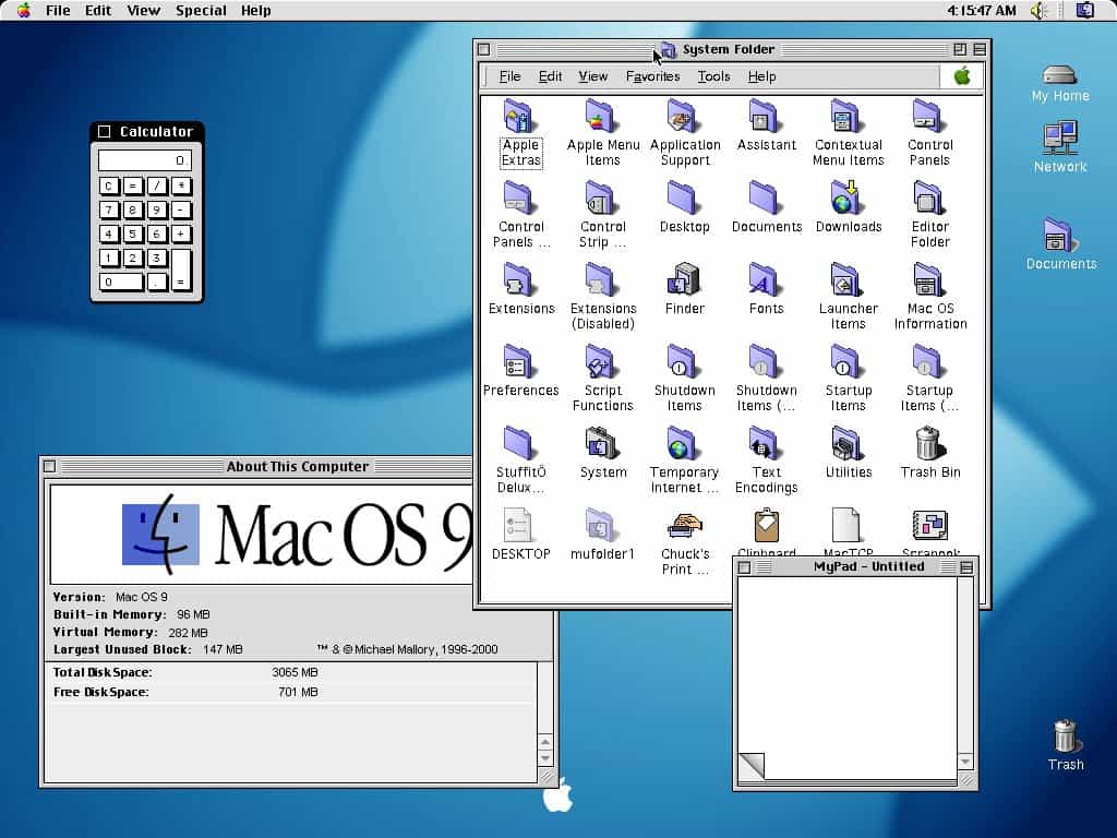
Seems to me that they need to take a page from Apple, circa 2000. Back then, they took about the biggest swing possible. They went from OS 9 which looked like this:

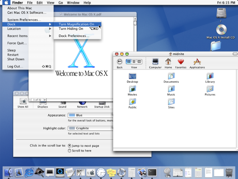
to OS X (commonly pronounced “OS ten”) which looked like this:

There was practically nothing in this move that wasn’t touched. It wasn’t an easy one either. Some apps wouldn’t work at all, while others ran in a special compatibility mode. It wasn’t just the look and feel, either. It took the better part of a year for people to figure out how to do the most basic things.
So here’s what Apple did: they made it optional at first.
You had three choices. You could still run OS 9. Or, you could run OS X but launch a full copy of OS 9 within it whenever you needed to. Or, you could jump in with both feet and run OS X. Most people chose the middle option. I know I did.
It still wasn’t easy and it took a lot of relearning. But by giving users options, people could jump in when they felt comfortable. No one felt pressure. By the time OS 9 was completely phased out a few years later, no one missed it.
Yes, I think it could. Today’s computers and phones are powerful enough to run emulation software if needed. I think that Microsoft, Google, and Apple could create whole new experiences for their users and make them optional. Give them the ability to switch in and out of them as needed. It wouldn’t have to be an all-or-nothing proposition. This would give early adopters something to talk about, and would give the manufacturers the chance to refine things as they went along. After a year or so, they could start phasing out the old experience, when it was determined that enough people had stopped using it and were reasonably happy with the new one. That’s how we could get real reinventions of the way we interact with our devices. And I think that time is long overdue.
Because, I get it. There are going to be some folks who just want to use their devices to do work. This is especially true with computers, which have begun to fall squarely in the “I only use it when I have to” camp. You don’t want to have to try to remember new steps just to answer a phone call, or train yourself how to add an appointment all over again. But remember, you did those things once. There was a time you answered a phone call by picking up a physical handset. You learned how to press or slide the green button to answer. It didn’t take too long. Why are you afraid to do it again?
It’s been a decade since there was genuinely anything big to talk about when it comes to our devices. We’ve become accustomed to getting excited about little things like adding seconds to the clock or seeing the battery percentage inside the battery icon. It’s time to dust off those thinking caps and move into the future. At least I hope it is. I didn’t like Windows 8, but it wasn’t boring. I’m tired of being bored.
The post EDITORIAL: Updates are too boring appeared first on The Solid Signal Blog.
Continue reading...
Your phone may get an update soon, too. Or, it might have just gotten one. iPhone fans will be looking forward to iOS 17, while users of fairly current Androids might have already gotten Android 12. And you know what, they’re boring too.
Here’s what I’m talking about.
Windows’ latest update has huge new feature functionality like “This update provides the total amount of storage capacity of all your Microsoft OneDrive subscriptions. It also displays the total storage on the Accounts page in the Settings app.” I’ll tell ya, I don’t know how I ever lived without that.
iOS 17 will create blooms of joy for its users because it will have a “journaling app” that lets people record things about their day. Um, I’m pretty sure TikTok has that covered.
As for Android 12, its “Material You” update is touted as a big thing. It sure is: it makes some of the sliders fatter and some apps will pull their color schemes from your wallpaper.
Is it me, or are these all pretty small tweaks? That would be fine if they were advertised as such. But these are the halo features of the updates for our major devices. These are the earthshattering things that make life worth living, if you believe the folks who wrote them.
We’ve gone too far the other way
There was a time when updates were massive swings. Think of Windows 8, where Microsoft more or less threw away everything you liked about your computer. Or perhaps iOS 7, which changed the look of every icon and control on your phone. These were real updates. And some of them were total garbage. People railed against those big updates. In some cases they cried so hard that the manufacturers rolled things back to the way they were. Still, you have to applaud the companies that tried to do something innovative, even if they failed.
The last big swings, the ones I talk about in the previous paragraph, were a decade ago. Since then, OS makers have tiptoed around providing tiny changes to functionality. Even when they did that, they still came under fire. When Microsoft DARED to center items on the taskbar, people screamed. Never mind that pretty much every other device with some sort of app launcher at the bottom already centers things. People couldn’t believe Microsoft would do such a thing.
And yeah, I get it. For the most part most of us just want to use our devices. We don’t want to have to learn how to use them all over again. We also don’t want to lose that one big feature we loved and no one else did. That happens all too often with OS updates.
But we’ve gotten to the point where these companies are so afraid of hurting someone’s feelings that they’ve stopped making changes altogether. They’ve gone too far the other way.
What can be done?
It’s foolish to think that our phones and computers have evolved as far as they ever need to. There should be a massive user interface change brewing at some point and I’m personally hoping they’ll be smart about it. I do get that it’s been a big hurdle in the past and it’s created unhappiness for users.
Seems to me that they need to take a page from Apple, circa 2000. Back then, they took about the biggest swing possible. They went from OS 9 which looked like this:

to OS X (commonly pronounced “OS ten”) which looked like this:

There was practically nothing in this move that wasn’t touched. It wasn’t an easy one either. Some apps wouldn’t work at all, while others ran in a special compatibility mode. It wasn’t just the look and feel, either. It took the better part of a year for people to figure out how to do the most basic things.
So here’s what Apple did: they made it optional at first.
You had three choices. You could still run OS 9. Or, you could run OS X but launch a full copy of OS 9 within it whenever you needed to. Or, you could jump in with both feet and run OS X. Most people chose the middle option. I know I did.
It still wasn’t easy and it took a lot of relearning. But by giving users options, people could jump in when they felt comfortable. No one felt pressure. By the time OS 9 was completely phased out a few years later, no one missed it.
Could such a strategy work today?
Yes, I think it could. Today’s computers and phones are powerful enough to run emulation software if needed. I think that Microsoft, Google, and Apple could create whole new experiences for their users and make them optional. Give them the ability to switch in and out of them as needed. It wouldn’t have to be an all-or-nothing proposition. This would give early adopters something to talk about, and would give the manufacturers the chance to refine things as they went along. After a year or so, they could start phasing out the old experience, when it was determined that enough people had stopped using it and were reasonably happy with the new one. That’s how we could get real reinventions of the way we interact with our devices. And I think that time is long overdue.
Because, I get it. There are going to be some folks who just want to use their devices to do work. This is especially true with computers, which have begun to fall squarely in the “I only use it when I have to” camp. You don’t want to have to try to remember new steps just to answer a phone call, or train yourself how to add an appointment all over again. But remember, you did those things once. There was a time you answered a phone call by picking up a physical handset. You learned how to press or slide the green button to answer. It didn’t take too long. Why are you afraid to do it again?
Time to take some chances
It’s been a decade since there was genuinely anything big to talk about when it comes to our devices. We’ve become accustomed to getting excited about little things like adding seconds to the clock or seeing the battery percentage inside the battery icon. It’s time to dust off those thinking caps and move into the future. At least I hope it is. I didn’t like Windows 8, but it wasn’t boring. I’m tired of being bored.
The post EDITORIAL: Updates are too boring appeared first on The Solid Signal Blog.
Continue reading...

